HECHO EN DUMBO
COMMERCIAL
HECHO EN DUMBO
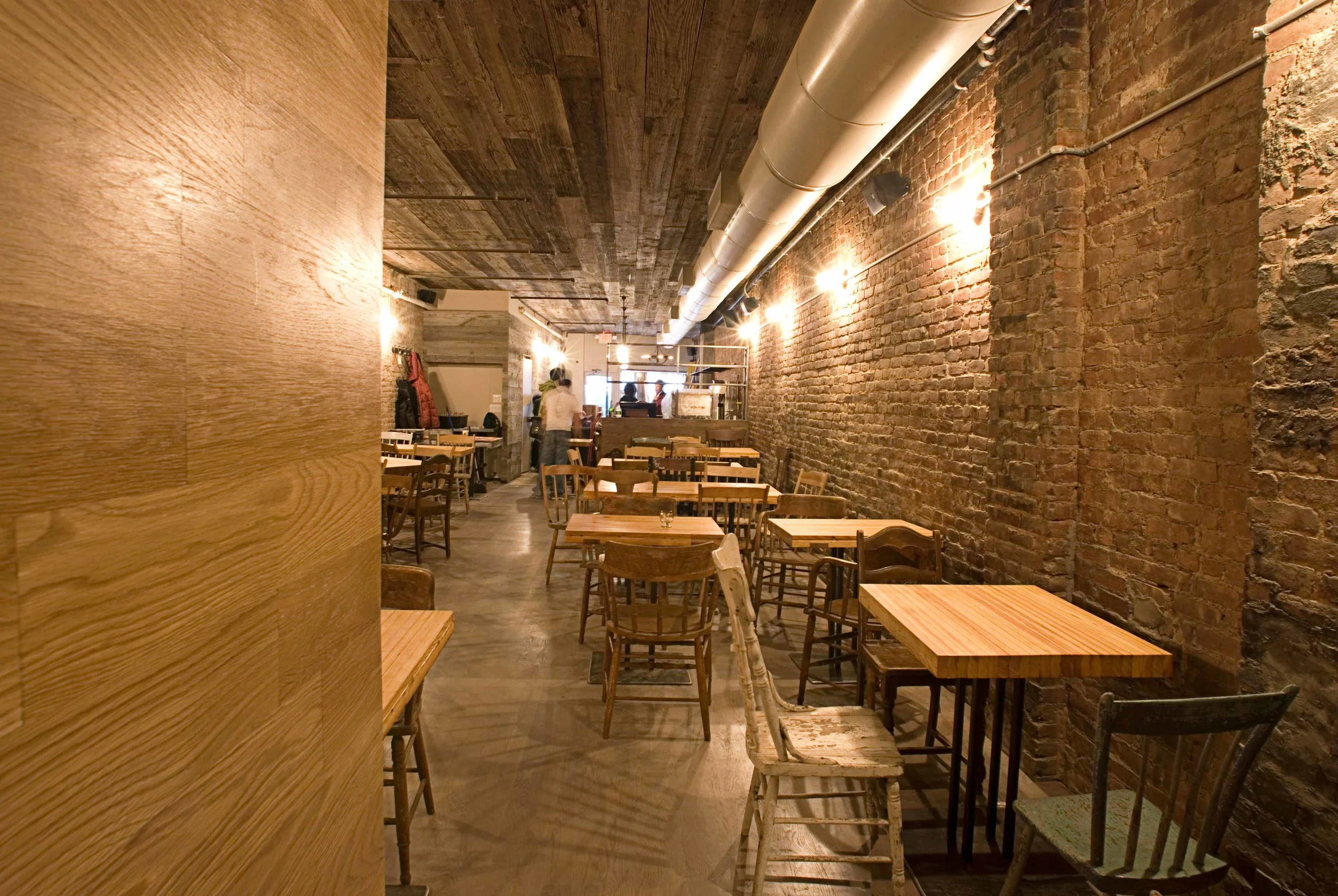
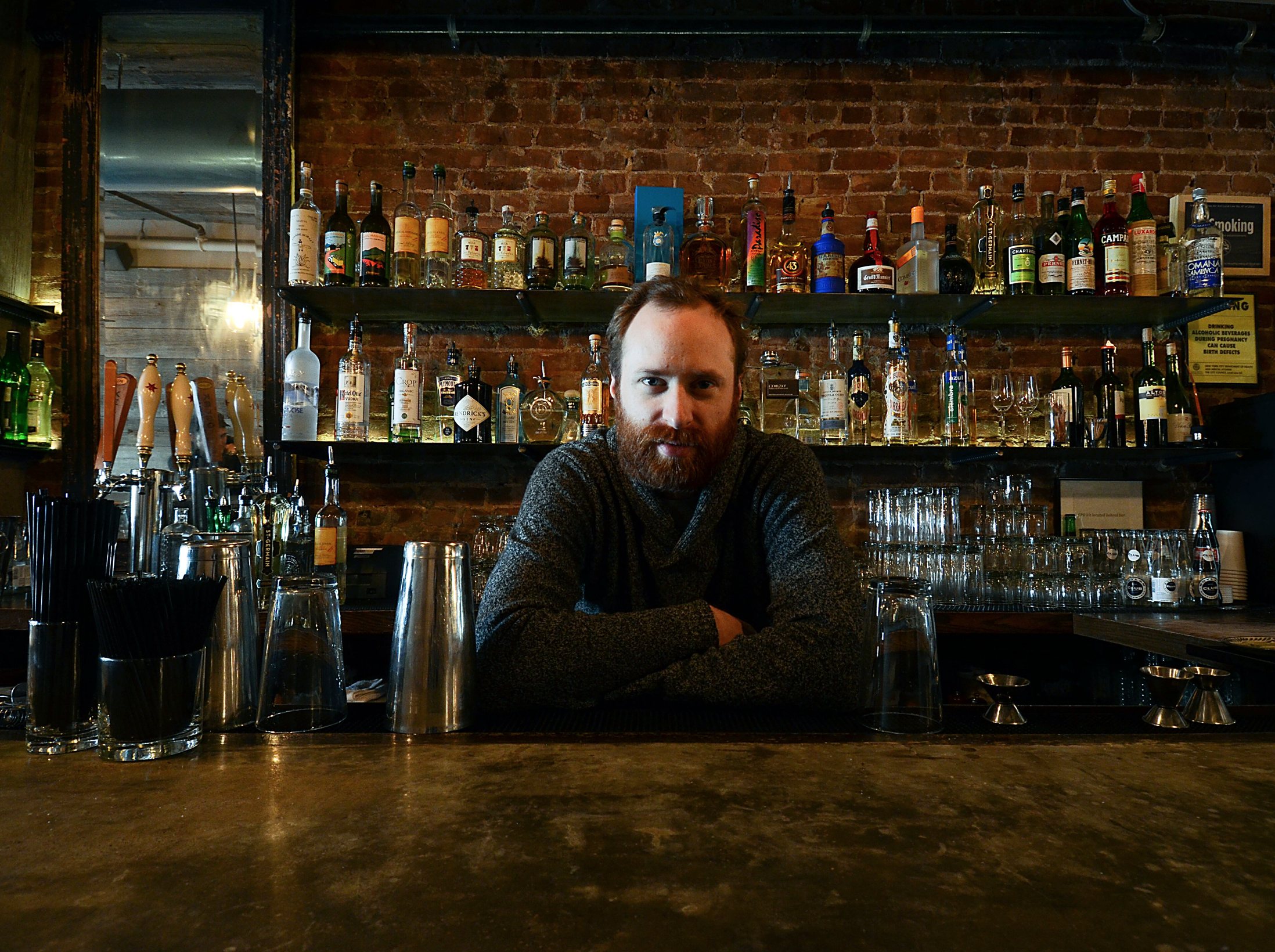
In stark contrast to the majority of Mexican restaurants in and around New York City, and in the U.S. in general, the decor forwent the ubiquitous pastel palette and sombrero-type iconography commonly associated with Mexico and instead treated its costumers to a hip, rustic ambiance of exposed brick and pervasive candlelight, with a design scheme inspired by Mexico's unique ability to repurpose materials, including reclaimed wood and metals, fashioning them into sophisticated furniture and fixtures. The first step was to start cleaning the space, that had been occupied by a previous tenant, in the process removing instead of adding pieces became the became the generative principle for the design of the space.
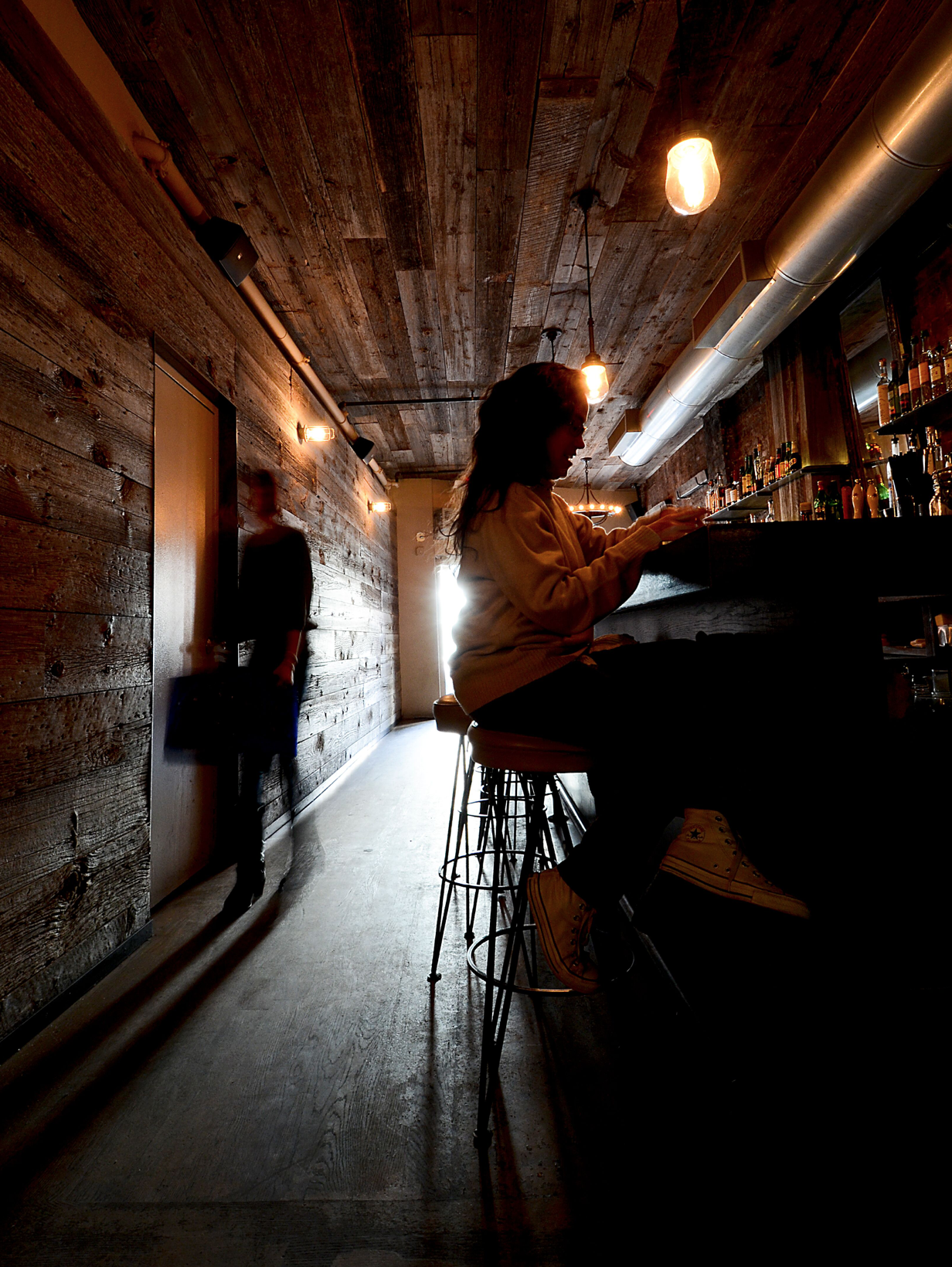
Hecho en Dumbo was created on the concept of re-used / re-cycled / re-contextualized / re-claimed materials and elements as driving forces based more on necessity rather than aesthetics. Recycled bowling alleys were used to make the tables, old structural beams were reused as bathroom and bar counters, reclaimed barn wood is now covering the entire space accentuating the dramatic perspective of the restaurant, and reused lighting fixtures are now illuminating the main dining space. Dualities were constantly challenged in the attempt to create a cozy but modern space where past and future blend into one single space.
"We used certain typical elements from Mexico such as tiles, patterns, and furniture that when re-arrange in a new or different way you change the reading of the final piece, hence The Mexican elements are there unconsciously but in a fresh and different way. For example we selected a traditional talavera plate, that normally has a very typical pattern in various colors, and we decided to keep the pattern but opted for a monochrome slate gray that gives a new reading and a more conceptual presence as the plates you use to share all the amazing antojitos. Likewise with the bathroom tiles, we chose a cobalt blue hexagon which alludes the vibrant and colorful Mexican spirit but, instead of mixing it with a whole variety of colors to create an ornamental motif, we decided to go with a more abstract version and intensify the cobalt blue. There is a NEW READING of what Mexico City is: a dynamic city full of striving artists, chefs, architects, designers, photographers, and more that are looking for fresh and novel ideas using their history. It is a place located in NYC but with a Mexico City vibe, a perfect marriage of both identities."
Location: Manhattan, New York City
Project Year: 2010
Project Area: 2,000 SQFT
Status: Built
PHOTOGRAPHY: PHILIPPE PETALAS


